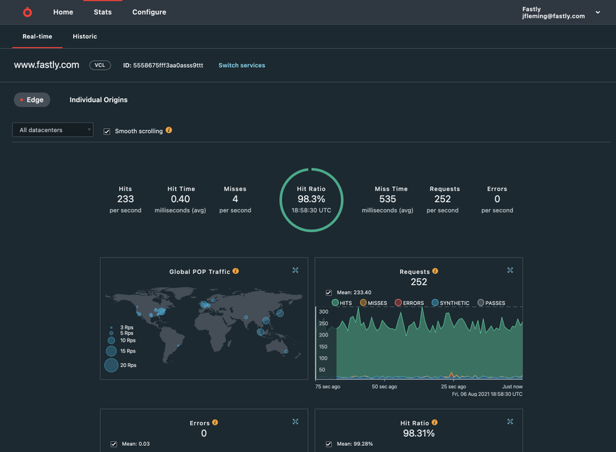
Wearing blue light glasses, taking regular breaks, and using eye drops — we know you may have tried it all in the hopes of reducing eye strain and optimally performing your job. We are making it a little easier with the introduction of dark mode for the Fastly control panel.
Whether you prefer dark mode to limit eye strain or simply for aesthetic reasons, our control panel now supports both light and dark themes, allowing you to choose which works best for you.
Why we created dark mode
Providing a positive user experience in our control panel is a top priority for our product design team. We’ve heard your requests and made dark mode the latest of these design updates. With it, you enjoy all the same functionality of light mode, with some key benefits:
Reduce eye fatigue in low-light conditions or at night. Dark mode also accommodates accessibility issues around migraines, visual impairments, and eye fatigue
Comfortably display our real-time stats on a monitor in a dark server room without altering the mood
Diff your service versions in our code viewer, which has a similar feel to common code editor appearance preferences
When designing and developing dark mode, we focused on legibility, brand harmony, and ease of use. The palette reflects our latest visual language, including cool, dark slate greys and a wide range of color tints and shades.

How we use design tokens for easier updates
We’re now using design tokens as we build our latest user interfaces. Design tokens are each conformed by a name and a value. Our design and engineering teams can refer to such names colloquially and help standardize the way we store style properties like colors and fonts in our code. They facilitate collaboration between teams and ensure a consistent brand experience for users.
For dark mode, we defined all our colors as tokens, e.g., `grey-90,` and used them to determine the values of more specific functional tokens, e.g., `background-color--primary.`
In the case of our control panel, we used custom CSS properties to change the values of the functional tokens depending on the user setting, so `background-color--primary` can be `grey-00` regularly, but will be `grey-90` when dark mode is enabled. This not only allowed us to implement a new visual design theme but also helped us tighten up our style code for scalability and reuse.
We also use design tokens for things like typography and dimensions, and soon we’ll use them to bring more consistency to other aspects of our UI. This helps us apply our style updates in a single place with minimum code changes, so we can improve your user experience more quickly and efficiently.
Modern Javascript frameworks provide integrations for theming that are built on this concept, so whether you maintain your CSS, use CSS-in-JS, or employ open-source theming alternatives, the concept is fundamentally the same: put your design decisions in one place and refer to them by names that people can easily refer to and use.
How to enable dark mode
Our interface allows you to seamlessly switch between dark and light modes via your account settings menu to suit your environmental needs. To turn down the lights, head to Account > Appearance in the control panel.
Our Developer Portal and Documentation already provide dark and light modes based on your operating system setting for theme or user agent setting.
We’d love to know what you think of dark mode. Your feedback is essential in helping us provide a more accessible experience for our control panel. Hit us up at design@fastly.com, and let us know what you think.

