We know our customers need complete visibility into what’s happening with their applications; with Fastly, we strive to give you instant feedback at the edge, allowing you to innovate and iterate in real time. With that in mind, we’re pleased to announce the next generation of the Fastly control panel. It’s the same platform you know and love with improved navigation and a more intuitive user experience. In this post, we’ll discuss some of the changes made and the reasoning behind them, with more details to come in future posts.

We invite all customers to give it a try and provide us with feedback. You’ll still see the old web interface when you log in to your account — simply click on the button at the top to access the new control panel. You’ll be redirected to manage.fastly.com, which will be your new portal for logging in.

Where we were
As with many startups that grow quickly, we built and iterated on our web interface as frequently as we could, but ultimately realized that a rewrite was necessary to scale. Our original control panel codebase (written in Coffeescript and based on Backbone) had been written and rewritten by just a few engineers (really smart engineers, but not designers at heart).
Furthermore, our customer base has been increasing both in terms of company size and diversity, and we’ve subsequently had to rethink how we accommodate that range. The new control panel allows for improved navigation, easier interpretation of data, and quicker access to existing configurations. With this redesign, we’re staying true to our core values — giving customers complete visibility and ultimate control over how they serve content — while creating a more intuitive user experience for everyone.
What’s changed: a sneak peak
We started using a common style guide to match our shiny new website, which was redesigned earlier this year, helping us maintain a cohesive style across the board. The new control panel comprises reusable patterns and component libraries — this is important as we introduce new features in the future.
We’ve summarized the changes below, but the best way to experience the new control panel is to try it out for yourself.
The Dashboard
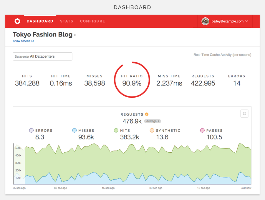
We rethought the overall information architecture, using typography and grids.
We changed the graph style to make it easier to interpret live data.

The service summary
We moved many of the actions into a gear dropdown in the upper right.
We also put the links at the top of the screen so you can quickly navigate to existing configurations or create new config versions.

The configuration panel
We moved the tab navigation to be horizontal across the screen, allowing more space for your configuration settings.
We also included a summary of each tab’s contents.

What’s next
This is only the beginning — we’re continuing to iron out the new design, fix bugs, and incorporate your feedback. You’ll hear more from the UX team over the next few months on the technology behind the new control panel (hint: it involves Ember), as well as our redesign process and how we’ve structured a growing UX team. We look forward to hearing from you — you’ll find a form in the control panel footer where you can send us your thoughts. As always, if you have any questions, don’t hesitate to contact us.
